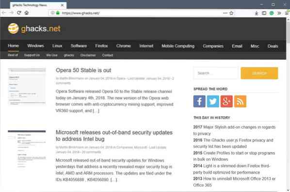
You may have noticed already that we have activated the new Ghacks theme finally on the site. I hope you like it as much as I do, and I'd like to take the opportunity to point out a couple of things about the new theme.
Before I do that, I'd like to thank Daniel Pataki for his awesome work in creating this new theme for the site. This theme would not be possible without him.
One of my main requirements for the new theme was that it should not diverge too much from the current one. I wanted to keep the general layout and order on the site so that it would not be a shock to users.
I know how hardcore some users are when it comes to changes, and keeping the general layout would certainly reduce the number of complaints and criticism.
Some things have changed however and I'd like to point those quickly:
- The site should load a lot faster.
- The main content ad unit was moved to the header. This means, no ads in content anymore.
- The top nav menu was changed. It consists of a main menu and a submenu now. Most main menu items are still there so that there is not much change in that regard. The submenu lists the other categories, all major tags, and some important articles as well. Basically, we moved all entries from the sidebar to the top.
- Text and headings are improved. Readability should be better on all devices.
- We have added a "support us" box below articles. This is one of the way that you can support us. Once we get enough support this way, we will get rid of ads on this site. Supporters may get a Ghacks account, and when they are signed in, won't see any ads on the site.
- The comment section has a new design. We still use a locally hosted solution, so no third-party tracking going on. The new design should make it easier to find your way around in the comment section, and distinguish threads.
- Update: Forgot to add, we have new sidebar widgets. A "this day in history" widget that lists posts of previous years, and the new last updated widget that lists articles that were updated the last.
We work on the display of thumbnails as we speak. They are blurry and that is something that needs to change.
Feel free to add comments, positive or negative, to the comment section below. I will read all of them and will take all comments into consideration. If you notice any issues, let me know specifically, as we will correct those asap then.
There is still a chance that we may need to restore the old theme. This will be the case if something unforeseen happens, for instance if issues cause traffic to drop.